Product design portfolio examples that pass the 30-second hiring scan
Learn how to structure case studies around ownership, key decisions, shipped scope, and outcomes so hiring teams see your value fast. Explore the examples.
By Ajay Khatri ·

TL;DR
Many product design portfolio examples are easy to admire but hard to evaluate. We recommend treating a product design portfolio as an evidence hierarchy: show the problem, personal ownership, defining decision, shipped scope, and defensible outcome before asking anyone to read the full process.
Table of Contents
- Product design portfolio examples through a 30-second hiring scan
- The evidence hierarchy every strong example makes visible
- Four product design portfolio example patterns that earn a closer look
- Worked example: reading the Hevo Blog UI redesign as product evidence
- Showing individual contribution without erasing the team
- Proving impact when exact metrics are confidential or incomplete
- What AI-generated polish cannot prove in a product design portfolio
- A fast scorecard for comparing product design portfolio examples
- FAQ
- Build a portfolio that proves the work
Product design portfolio examples through a 30-second hiring scan
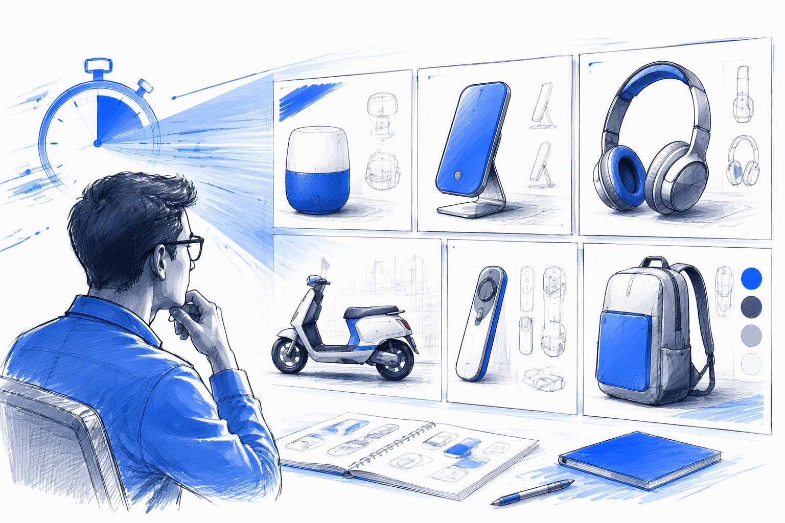
A hiring manager opens a portfolio between meetings. The first scan should answer five questions: What did this person work on? What did they own? What changed? Did it ship? Why should I keep reading?
We use 30 seconds as a pressure test, not a universal hiring statistic. The purpose is to see whether a project communicates enough value during an initial scan to earn closer attention.
Our view is simple: hiring teams need an evidence hierarchy, not a chronological documentary of the entire design process. Attractive presentation matters, but it should guide reviewers towards evidence rather than conceal its absence.
This framework applies mainly to digital product portfolios spanning UX, UI, product strategy, and frontend work. Industrial-design and academic portfolios may require different formats and evidence.
For more inspiration, our guide to product designer portfolio examples explains how we distinguish credible work from polished presentation.
What is a product portfolio example?
A product portfolio example is a project presentation that demonstrates decisions, individual contribution, execution quality, and outcomes. It is more than a collection of attractive screens.
A single case-study card can provide a useful example. The complete portfolio adds context about positioning, range, depth, working style, and suitability for a role.
Why 30 seconds is a useful test
The test does not require a designer to explain an entire project in half a minute. Instead, it asks whether the strongest evidence appears early enough for a reviewer to know what deserves further investigation.
If the problem, role, and result remain unclear after the opening section, adding more process diagrams will rarely solve the issue.
The evidence hierarchy every strong example makes visible
Before showing research repositories or wireframe progressions, we recommend surfacing six signals:
- The product or user problem
- The designer’s role
- The designed or shipped scope
- The defining constraint
- The consequential decision
- The most defensible outcome
These details can fit into a compact overview. For example:
Simplified account setup to address recurring onboarding problems. I owned the UX, interface system, and production frontend while working within the existing identity service.
Routine artifacts belong only when they explain a decision, challenge an assumption, or change the project’s direction. A workshop photograph proves that a workshop happened; it does not prove product judgment.
Our product designer portfolio criteria for hiring teams offer a broader framework for reviewing complete portfolios.
Evidence visible before the first deep read
A reviewer should quickly be able to identify:
- The project type and problem
- Personal ownership and collaborators
- The platform, delivery status, and scope
- One consequential decision
- One outcome worth investigating
The overview need not answer everything. It only needs to establish a credible reason to continue.
Evidence that can wait
Full research repositories, workshop photographs, generic process diagrams, and every wireframe iteration can appear later. Place supporting evidence beside the decision it explains so the case study forms a clear argument.
For a fuller assessment, use our portfolio product design credibility audit.
Four product design portfolio example patterns that earn a closer look
Strong examples are not always elaborate. They organise evidence so that hiring teams can recognise it quickly, and one case study may combine all four patterns below.
The outcome-first example
Signal: The project starts with a meaningful change and identifies the designer’s role.
Strong version:
Simplified account setup to address recurring onboarding failures. I owned the flow, interface system, and production frontend.
Weak version:
We redesigned onboarding to create a seamless and delightful experience.
The stronger version names the affected behaviour and personal scope. If metrics are available, include their baseline, measurement period, and context instead of presenting an isolated percentage.
The decision-led example
Signal: The case study explains a consequential choice, the alternatives, and the accepted trade-offs.
For example, show several rejected navigation structures, the constraint affecting each one, and why the shipped direction better supported content discovery. That reveals judgment. An unexplained final mockup does not.
The contribution-clear example
Signal: Personal ownership is separated from the team’s combined work.
I led the onboarding flow and interaction design. The product manager defined commercial requirements, the researcher ran interviews, and the engineers implemented the service layer.
Precise verbs—such as led, designed, prototyped, implemented, validated, and supported—make responsibility easier to understand.
The shipped-execution example
Signal: UX reasoning and UI craft are supported by evidence of real behaviour.
Useful proof includes responsive layouts, loading and error states, accessibility considerations, live interactions, implementation details, and changes caused by engineering constraints.
Static screens show intended appearance. Shipped execution shows whether the concept survived real content, edge cases, and technical limitations.
Worked example: reading the Hevo Blog UI redesign as product evidence
A blog redesign becomes product evidence when it connects interface decisions to content discovery and engagement goals. The problem is not simply “make the blog look modern.” It is helping readers find relevant material and continue exploring.
For the Hevo Blog UI redesign, the case-study chain should be explicit:
- Identify the hierarchy or discovery problem.
- Define the relevant engagement goal.
- Explain how the content model influenced grouping.
- Show how visual emphasis supported scanning.
- Demonstrate responsive and interactive behaviour.
Our scope should be equally precise across UX thinking, UI craft, and frontend execution. Before-and-after views help only when annotations explain what changed and why. Readers can inspect the wider context in our design portfolio.
What should appear in the 30-second layer
The opening should include the discovery problem, our role, the platform scope, a central constraint, one defining decision, and a qualified outcome.
One annotated comparison is often more informative than several decorative device mockups. Its notes should direct attention to hierarchy, content grouping, or behaviour.
What earns the deeper read
The full case study can examine trade-offs involving navigation, grouping, visual emphasis, and responsive behaviour. It should also show what changed during implementation.
Claims about engagement must match the available evidence. We can explain how a decision supported an engagement goal without claiming that one visual change caused a wider business result.
Showing individual contribution without erasing the team
Ownership clarity belongs near the beginning of a case study. We recommend a compact role line covering what the designer led, made, influenced, and shipped, followed by context about collaborators.
The goal is to clarify decision boundaries:
- Who supplied the evidence?
- Who owned commercial or technical requirements?
- Who influenced the direction?
- Who created the deliverables?
- Who implemented the released experience?
This avoids two weak extremes: claiming the whole product or reducing substantial leadership to “worked with the team.”
A contribution statement that scans quickly
A reliable structure is:
I led [scope], designed [deliverables], partnered with [roles], and shipped [release or implementation].
Follow it with one decision the designer can explain in detail. Specific knowledge of that decision is stronger evidence of ownership than a long activity list.
How shared work becomes credible evidence
Attribute team outcomes collectively while connecting personal claims to observable artifacts and decisions. A designer may own the interaction model without owning the research programme, technical architecture, or commercial target.
Professional accounts of disagreement can also show judgment. Explain the competing constraints, evidence, and resolution rather than the interpersonal tension.
Proving impact when exact metrics are confidential or incomplete
Fabricated precision destroys trust. So do vague claims such as “increased engagement” without supporting context.
When presenting impact, use the strongest evidence available. That may be an exact metric, an approved range, target attainment, a directional signal, observed behaviour, an operational change, or a validated decision.
Every claim needs context: what changed, for whom, during which period, and what other factors may have influenced the result.
Defensible alternatives to confidential numbers
Useful alternatives include:
- Approved ranges or relative movement
- Confirmation that an internal target was met
- Changes in recurring support issues
- Adoption or completion signals
- Approved anonymised feedback
- Observable operational changes
If details cannot be shared, state the limitation directly. Clear uncertainty is more credible than disguised certainty.
Claims that weaken trust
Unexplained percentage lifts, missing baselines, and metrics unrelated to the original problem weaken a case study. So does attributing a broad commercial outcome solely to a visual redesign.
Match the outcome to the intervention. A hierarchy project should usually present evidence about discovery, navigation, or content interaction rather than an unsupported revenue claim.
What AI-generated polish cannot prove in a product design portfolio
AI can accelerate exploration, interface production, and writing. It cannot establish how an option was validated, who resolved conflicting requirements, or whether the work survived production constraints.
A strong portfolio should therefore expose:
- Constraint handling
- Trade-off reasoning
- Stakeholder alignment
- System behaviour
- Accessibility decisions
- Implementation judgment
- Measured or observed consequences
When AI supported the work, say so. Then clarify who assessed the output, handled risks, and made the final decision.
Our guide to the best product designer portfolios for 2026 explores these expectations further.
Signals of judgment over generation
Show rejected directions and explain why they failed. Edge cases, accessibility choices, component rules, and delivery compromises reveal thinking beyond the ideal screen.
Judgment becomes visible through selection and adaptation, not through the volume of generated alternatives.
Signals of shipped execution
Distinguish clearly between:
- Exploratory concepts
- Validated prototypes
- Production-ready specifications
- Released products
This prevents speculative work from being mistaken for shipped impact.
A fast scorecard for comparing product design portfolio examples
There is no universally best portfolio. The strongest one presents evidence suited to the role, product context, and expected scope.
We recommend reviewing five dimensions:
| Dimension | What to evaluate |
|---|---|
| Relevance | The problem matches the role |
| Ownership | Personal contribution is precise and believable |
| Decision quality | Choices and trade-offs are explained |
| Outcome credibility | Results are contextual and defensible |
| Shipped execution | Behaviour beyond static mockups is visible |
Visual craft supports clarity and confidence, but it cannot replace product evidence. Our guide to the evidence behind the best product design portfolios covers these trust signals in more detail.
Five questions to ask before opening the full case study
- Is the problem relevant?
- Is personal ownership clear?
- Is there a consequential decision to investigate?
- Is the outcome defensible?
- Did the work progress beyond a static mockup?
A strong example need not answer every question immediately. It should make the next question worth asking.
When an attractive example should still be closed
Warning signs include unexplained screens, generic process diagrams, blurred ownership, unsupported impact claims, and no distinction between concept and shipped work.
Presentation earns attention. Evidence earns confidence.
Where to go for the complete portfolio audit
The initial scan does not cover project selection, full case-study structure, website-versus-PDF decisions, or every possible red flag.
Use our complete portfolio product design audit for a portfolio-level assessment.
FAQ
What should a product design portfolio include?
It should include relevant projects, clear ownership, meaningful decisions, constraints, shipped scope, and defensible outcomes. Research artifacts should appear when they explain a decision or changed the project’s direction.
Is AI replacing product designers?
AI is changing production, but generated output does not replace judgment, validation, collaboration, accessibility work, or accountability. Portfolios should make those human decisions visible.
Who has the best product design portfolio?
There is no universal winner. The best portfolio for a role presents relevant, credible evidence of ownership, decision quality, execution, and outcomes.
What is a product portfolio example?
It is a project presentation showing the problem, contribution, decisions, execution, and outcome. Attractive screens can support that evidence, but they cannot replace it.
How many case studies should a portfolio contain?
There is no fixed number that suits every designer. We recommend prioritising a small selection of relevant, well-supported projects over a larger collection of shallow summaries.
Build a portfolio that proves the work
Review each project at scan speed. If the problem, ownership, defining decision, shipped scope, and outcome are not clear, edit before adding more screens. For UX, UI, and frontend collaboration on an evidence-led digital product, explore our work and get in touch.