UI and UX design services: a scope-first guide to work that ships
Learn how to scope UI and UX design services around product risk, reduce uncertainty, and create accessible, buildable experiences. Explore the guide.
By Ajay Khatri ·
TL;DR
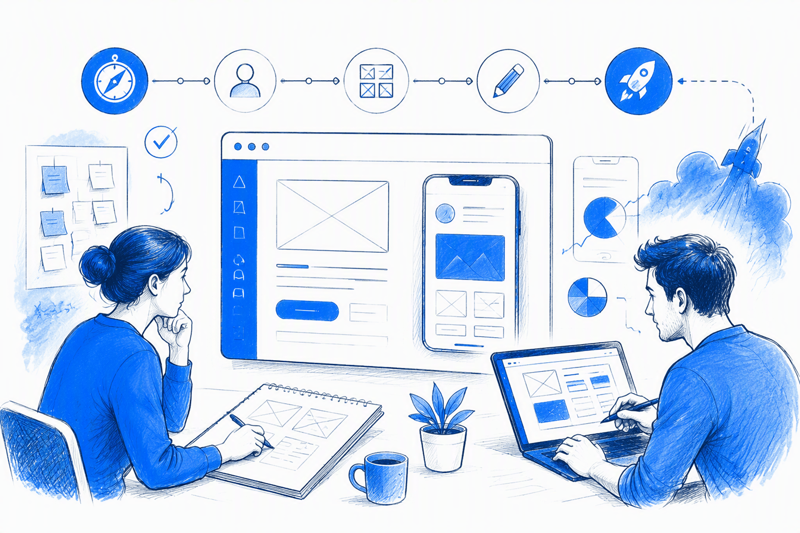
The best UI and UX design services do not produce the most screens. They remove the uncertainty stopping a product from becoming useful, distinctive, accessible, and buildable. We recommend selecting research, UX, UI, system, and frontend support around the product’s highest-risk unanswered question rather than buying a preset process.
Table of Contents
- What UI and UX design services should solve before screens are designed
- Match the product problem to the right UI/UX service scope
- A lean workflow from product risk to production-ready interface
- What a production-ready UI/UX deliverable should include
- Use a design system when inconsistency becomes the product problem
- How to evaluate UI/UX work beyond a polished portfolio
- What determines the cost of UI and UX design services?
- What AI changes—and what product design judgment still owns
- From generic to impact-driven: applying the framework to Freshway App
- FAQ
- Bring us the product problem
What UI and UX design services should solve before screens are designed
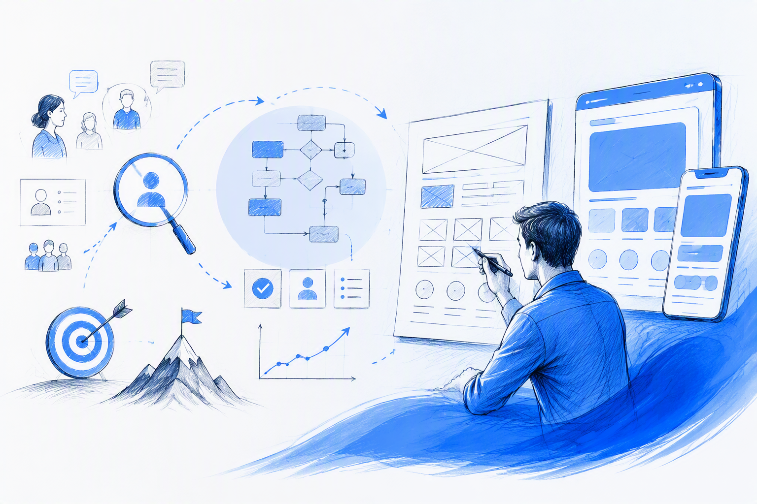
A UX designer maps the journey. A UI designer changes the visual language. A developer rebuilds both. By launch, the product feels as though nobody owns the complete experience.
That failure begins when UI and UX design services are purchased as a menu of artifacts instead of a set of decisions. A product team rarely needs “all UX” or “all UI.” It needs enough evidence, structure, interface definition, and implementation support to resolve a specific product risk.
UX involves understanding user problems, structuring journeys, reducing friction, and validating consequential decisions. It can include research, information architecture, flow design, wireframes, prototypes, usability testing, and iteration. Those are methods, however, not the outcome.
UI turns product logic into a usable interface. It covers hierarchy, typography, color, spacing, interaction feedback, responsiveness, accessibility, components, and visual identity. Good UI makes the intended action clear while giving the product a recognizable character.
Product design connects UX and UI decisions to business priorities throughout the product lifecycle. It considers what should be built, why it matters, how people will understand it, and how the experience should evolve after launch.
Frontend design adds a practical question: can the intended behavior be implemented reliably across real content, devices, breakpoints, states, and technical constraints? It is not simply the conversion of a Figma file into code. It preserves product intent during implementation.
These disciplines have useful boundaries, but treating them as isolated cosmetic phases creates avoidable rework. Content affects layout. Navigation shapes component requirements. Visual hierarchy influences task comprehension. Technical feasibility can change an interaction before it becomes expensive to revise.
Teams comparing a hybrid designer, agency, or internal hire can use our guide to UI UX designing services and delivery models. Here, we focus on a more fundamental buying decision: what work does the product actually require?
UX, UI, product design, and frontend design in one practical model
We use one connected model:
- UX identifies and structures the right experience.
- UI communicates that experience through visible and interactive choices.
- Product design aligns those choices with product and business priorities.
- Frontend design verifies that the intended behavior survives implementation.
Consider a SaaS onboarding flow that needs simplification. At the UX level, that might mean removing unnecessary questions and changing the order of required steps. At the UI level, it changes hierarchy, progress feedback, validation, and the placement of supporting content.
At the system level, the decision may require new form variants, status patterns, and error behavior. At the implementation level, it can affect API dependencies, saved progress, validation rules, analytics events, and mobile behavior.
One decision travels through the whole product. A sequential handoff model can hide those connections until late in the project, when corrections are more disruptive and design intent is easier to dilute.
That does not mean one person must perform every task. It means each discipline must share the same problem definition, constraints, and decision logic. The interface should not look polished while contradicting the journey, and the journey should not rely on behavior the development team cannot support.
The outcome matters more than the deliverable list
A proposal might promise:
- User flows
- Wireframes
- High-fidelity mockups
- A clickable prototype
- A component library
- Developer handoff
That list says little about whether the work will solve the product problem. Ten wireframes are not inherently more useful than three. A large prototype is not automatically more convincing than a focused test of the riskiest interaction.
Better outcomes are specific:
- People can identify the next action without hesitation.
- Navigation reflects how the audience understands the content.
- A critical conversion path removes avoidable friction.
- Responsive behavior is defined rather than left to developer interpretation.
- Error, loading, empty, and success states support task recovery.
- Components remain consistent across design and implementation.
- The shipped experience preserves the hierarchy and interaction logic that were validated.
We therefore start with the problem, available evidence, uncertainty, and desired change. Deliverables follow from those inputs.
For a deeper breakdown of how to turn an ambiguous request into work that can be implemented, see our guide to scoping UI/UX design services that ship.
Match the product problem to the right UI/UX service scope
A useful UI/UX design services scope follows the riskiest unanswered question. It should not automatically expand into discovery workshops, a complete redesign, a brand refresh, a design system, and months of testing.
The right scope might be a two-flow audit or an end-to-end product definition. The choice depends on how much is known, what is failing, and which decisions carry the greatest product or implementation risk.
| Product symptom | Likely risk | Recommended activities | Expected output | What can usually be skipped |
|---|---|---|---|---|
| A new concept has not been validated | The team may build the wrong proposition or journey | Assumption mapping, lean interviews, critical flows, wireframes, focused prototype testing | Evidence-backed product direction and a testable core journey | Full visual system, exhaustive screens, production animation |
| One critical journey is underperforming | Friction or unclear sequencing may block completion | Analytics review, support-ticket analysis, flow audit, prototype, usability testing | Revised journey, evidence for key changes, defined states | Full rebrand, unrelated feature redesign, broad discovery |
| A working product feels dated or generic | Visual weakness may reduce trust, recognition, or comprehension | UI inventory, visual direction, hierarchy refinement, interaction states, component updates | Distinctive interface direction applied to priority screens | Replacing proven navigation or rewriting every flow without evidence |
| Conversion is weak | Messaging, hierarchy, trust, or interaction friction may obscure the next step | Funnel review, content hierarchy, interface experiments, responsive refinement, validation | Clearer conversion path and prioritized testable changes | Decorative redesign work disconnected from the funnel |
| Screens are inconsistent at scale | Fragmentation may slow teams and create usability or accessibility defects | Interface inventory, foundations, tokens, reusable components, usage rules, governance | Component library or design system with adoption guidance | Ground-up product redesign if core journeys already work |
| Designs are ready but development is uncertain | Undefined behavior may create rework or implementation drift | State coverage, responsive rules, component logic, annotations, assets, design QA | Developer-ready specification and implementation support | Additional discovery unless a core product assumption remains unresolved |
This framework separates a focused engagement from an end-to-end redesign. A focused engagement targets a known problem with a bounded set of flows, evidence, and decisions. End-to-end work addresses connected uncertainty across the product proposition, architecture, journeys, interface language, and implementation behavior.
Neither approach is inherently better. We want to avoid paying for broad activity when a narrow intervention can resolve the risk. Equally, we should not force a narrow intervention onto a product with foundational problems.
When a focused UX engagement is enough
Focused UX/UI design services work well when the product is operational, the affected journey is identifiable, and the team has enough evidence to define the issue.
A SaaS product with confusing onboarding, for example, may need:
- A review of analytics, recordings, or support issues
- A map of the existing onboarding flow
- Identification of unnecessary decisions or unclear content
- A revised flow and focused prototype
- Usability testing around the highest-risk steps
- UI refinement and complete interaction states
It probably does not need a full rebrand, an exhaustive persona exercise, or months of open-ended discovery.
The same principle applies to checkout abandonment, confusing navigation, and uncertain feature concepts. We gather enough evidence to distinguish likely causes, redesign the consequential moments, and validate the proposed change.
A focused engagement still needs clear boundaries. We recommend defining which user group, task, platform, and success signal are in scope. Otherwise, “fix onboarding” can quietly expand into account settings, lifecycle communication, billing, and the entire application shell.
When the product needs end-to-end design
Broader product design services become appropriate when problems are connected and cannot be isolated responsibly. Common signals include:
- The product model or value proposition remains unvalidated.
- Several user roles depend on connected journeys.
- Information architecture has grown without a clear structure.
- Navigation and content models conflict.
- The interface is fragmented across features or platforms.
- Core technical behavior remains unresolved.
- There is no stable visual or component foundation.
- Fixing one flow would expose contradictions elsewhere.
End-to-end does not mean using every research method or producing every possible artifact. It means carrying the relevant decisions from problem framing through UX, UI, validation, systemization, and implementation support.
An early-stage mobile concept may require assumption mapping, lean interviews, core flows, wireframes, and a testable prototype before visual polish is justified. A mature platform may instead require an interface audit, accessibility review, component rationalization, and governance without rethinking its entire product proposition.
Our practical buyer’s checklist for UIUX design services can help teams identify which service categories belong in a brief and which are optional.
A lean workflow from product risk to production-ready interface
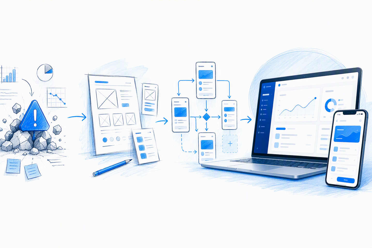
An end-to-end UI/UX design process should make decisions visible. It should not create process theatre through workshops and documents that do not change what the team builds.
We organize our workflow around seven actions:
- Frame: Decide which product problem matters, who experiences it, and what a better outcome means.
- Investigate: Decide what evidence is needed to reduce uncertainty.
- Structure: Decide how tasks, content, navigation, and dependencies should work.
- Explore: Decide which interface and interaction directions deserve development.
- Validate: Decide whether the proposed experience is understood and usable.
- Systemize: Decide which patterns should become reusable rules.
- Support implementation: Decide how responsive behavior, states, accessibility, and component logic will survive production.
These are not rigid phases. A mature product with reliable analytics and prior research may move quickly through investigation. Interface exploration can expose a structural flaw and send one flow back for revision. Component work can begin while priority screens are being validated.
The useful question is not, “Have we completed discovery?” It is, “Do we have enough confidence to make the next consequential decision?”
Direct collaboration keeps this process lean. Product, engineering, content, and design can resolve assumptions before they harden into screens. Short feedback cycles also make it easier to separate personal preference from a genuine usability, business, or technical constraint.
Discovery and lean UX research
Discovery should establish:
- The product and business goal
- The priority audience and context
- The task or journey under review
- Known constraints and dependencies
- Existing evidence
- Important assumptions
- Technical realities
- Signals that would indicate improvement
We then choose the smallest research method capable of reducing the identified risk. Possible methods include:
- Analytics review to locate drop-offs or unusual behavior
- Support-ticket analysis to identify recurring confusion
- Stakeholder interviews to expose goals, operational constraints, and conflicting assumptions
- User interviews to understand needs, context, language, and decision criteria
- Competitive pattern review to understand conventions and avoid predictable interaction mistakes
- Usability testing to observe whether a current or proposed journey works
More research is not always better. Several methods can repeat the same insight while delaying a decision. Conversely, a single stakeholder conversation is weak evidence for a high-risk workflow used by multiple groups.
We recommend matching evidence quality to the cost of being wrong. A reversible interface detail needs less validation than a new account structure, payment flow, or permissions model.
Flows, information architecture, and prototypes
Before investing heavily in visual polish, we resolve the sequence of tasks and the structure of information. This can include:
- Entry points and exits
- Decision points
- Required and optional data
- Navigation relationships
- Content priority
- Dependencies and permissions
- Recovery paths
- Empty and error conditions
Wireframes are valuable when they make structure easier to discuss. They are not valuable merely because a standard process says they must exist.
Prototypes should test consequential assumptions. If the risk concerns whether people understand a new grocery-browsing structure, the prototype needs realistic categories, product information, navigation, and feedback. It does not need every account-setting screen or an elaborate transition sequence.
The level of fidelity should match the question. A rough prototype can test task sequence and terminology. A high-fidelity prototype may be necessary when visual hierarchy, trust, brand expression, motion, or dense interaction behavior affects comprehension.
Interface design, validation, and implementation support
Interface design defines more than a visual theme. It establishes:
- Hierarchy and reading order
- Typography and spacing
- Color and contrast
- Responsive behavior
- Navigation cues
- Interaction feedback
- Loading, success, error, and empty states
- Component variants
- Accessible focus and input behavior
- A coherent visual identity
Validation continues here. A structurally sound flow can still fail if the primary action lacks emphasis, labels are ambiguous, controls are difficult to operate, or a mobile layout hides important context.
Implementation support closes the gap between the intended experience and the shipped product. It can include component discussions, responsive reviews, asset preparation, behavior notes, pull-request feedback, staging reviews, and design QA.
This is where frontend awareness becomes commercially useful. A designer who understands layout systems, component states, browser behavior, and implementation trade-offs can identify fragile concepts earlier.
For a fuller explanation, read our guide to UX/UI design services that connect product thinking to frontend reality.
What a production-ready UI/UX deliverable should include
We do not consider a “final Figma link” a complete definition of production readiness. A polished default screen can hide many unresolved decisions.
A strong acceptance checklist covers the experience under realistic conditions.
Core journey coverage
- Primary tasks and alternate routes
- Entry, exit, cancellation, and recovery paths
- Permissions and role differences
- Relevant first-time and returning-user behavior
- Dependencies between screens or steps
- Confirmation and next-step guidance
Responsive behavior
- Desktop, tablet, and mobile layouts where relevant
- Breakpoint priorities rather than arbitrary shrinking
- Navigation changes
- Content reordering
- Wrapping and truncation rules
- Fixed, sticky, collapsible, and scrollable elements
- Behavior for narrow screens and long content
Interaction states
- Default
- Hover
- Focus
- Active or selected
- Disabled
- Loading
- Empty
- Error
- Success
- Validation
- Partial or offline states where relevant
System and implementation detail
- Reusable components and variants
- Design tokens or foundation values
- Component anatomy
- Interaction and transition notes
- Content rules and realistic examples
- Assets in usable formats
- Accessibility considerations
- Known technical assumptions
- Open questions requiring engineering input
A buyer’s guide to build-ready UI/UX design deliverables provides a more detailed way to review what is included before approving a handoff.
Responsive behavior and complete interaction states
Responsive UI design is not a desktop layout squeezed into a narrower frame. A smaller viewport changes available space, touch behavior, navigation, density, and content priority.
Documentation should explain:
- What reflows into a new arrangement
- What collapses behind a control
- What wraps and what truncates
- What scrolls horizontally or vertically
- What remains fixed or sticky
- What changes order
- What becomes secondary
- What disappears and why
- How tables, charts, filters, and complex controls adapt
Real content is essential. A card that works with a short title may break with a realistic product name. A dashboard that appears balanced with placeholder data may collapse when real values, error messages, or localized content are introduced.
Non-ideal states deserve equal attention. Products frequently spend time loading, waiting for input, communicating errors, displaying no results, or handling incomplete data. If those states are missing, developers must invent them under delivery pressure.
Accessibility and readable hierarchy
Accessibility is a design constraint, not a final compliance layer. It influences color, interaction, structure, content, and component behavior from the beginning.
A production-ready accessible interface should consider:
- Keyboard access and logical navigation order
- Visible focus states
- Sufficient contrast
- Clear labels and instructions
- Appropriate control size and spacing
- Error identification and recovery
- Status communication that does not rely only on color
- Motion reduction or alternatives
- Semantic intent for headings, controls, and regions
- Form relationships and validation behavior
- Zoom, text scaling, and reflow
- Meaningful alternative-text requirements
Readable hierarchy also supports accessibility. Clear headings, grouped content, predictable control placement, and concise labels reduce interpretation effort for everyone.
Designers and developers should discuss semantics, not just pixels. Two controls may look identical while requiring different underlying elements because they perform different actions. That implementation distinction affects keyboard behavior, assistive technology, and maintainability.
Handoff versus frontend execution
A strong developer-ready handoff creates a shared understanding of component logic and behavior. Static screens are reference points; they are not the complete specification.
Handoff can include:
- Annotated designs
- Responsive examples
- Component variants
- State matrices
- Tokens and assets
- Interaction notes
- Acceptance criteria
- A live walkthrough
- Ongoing clarification and design QA
Designer-led frontend execution goes further. It can involve building interface components, translating visual systems into code, tuning responsive behavior, and working directly in the implementation environment.
Implementation review sits between those models. Engineering owns production, while the designer reviews staging builds, identifies deviations, and collaborates on practical corrections.
Frontend awareness improves all three approaches. It reveals when an attractive concept relies on brittle positioning, unrealistic content, missing states, excessive custom behavior, or a component abstraction that will not scale.
Use a design system when inconsistency becomes the product problem
A UI design system is useful when teams repeatedly solve the same interface decisions, produce conflicting versions, or introduce accessibility defects through inconsistency. It is not automatically necessary for every new product.
A compact component library may be enough for an early-stage application with one platform and a small team. A mature platform with multiple contributors, products, and implementation environments may need a fuller system with governance.
System work can include:
- An interface inventory
- Color, typography, spacing, grid, and elevation foundations
- Design tokens
- Component anatomy
- Variants and sizes
- Interaction states
- Content and accessibility guidance
- Usage examples
- Contribution and approval rules
- Versioning and maintenance ownership
Reuse can make design and development more efficient because established behavior does not need to be reinvented for every feature. It can also reduce inconsistencies and make accessibility more dependable when requirements are embedded in shared components.
The warning is simple: do not build an elaborate system before the product has stable patterns. A system created too early can formalize assumptions that are still changing, producing documentation debt instead of leverage.
Component library or full design system?
We recommend choosing the level of systemization based on four factors:
- Product maturity: Stable patterns justify more formal documentation than an experimental product.
- Number of contributors: More designers and developers create a greater need for shared rules.
- Platform breadth: Web, iOS, Android, and internal tools may require connected but platform-aware foundations.
- Rate of change: Rapidly changing product behavior needs lightweight governance that does not obstruct learning.
A component library provides reusable interface building blocks. It may include buttons, inputs, navigation, cards, dialogs, tables, and feedback patterns, along with the variants required by the current product.
A full design system adds broader foundations, content guidance, accessibility rules, design and code documentation, contribution processes, ownership, and governance. It is an operating model, not merely a large Figma file.
We start with frequently reused, high-impact patterns. Inputs, buttons, navigation, feedback, and data-display components usually deserve attention before rare edge-case components. Systemization should follow actual product demand.
Distinctive does not have to mean inconsistent
Consistency does not require a generic interface. A product can use expressive typography, imagery, color, motion, shape, and interaction while maintaining clear, reusable rules.
The key is to separate identity from unpredictability. A recognizable visual language can live within stable components, spacing logic, interaction feedback, and accessibility requirements.
For example, a grocery product might use bold produce-inspired color, editorial imagery, and energetic transitions. Those choices can coexist with clear categories, readable product cards, familiar cart behavior, predictable filtering, and visible focus states.
We protect proven navigation and conversion paths unless evidence supports changing them. Distinctive design should strengthen recognition and character without making routine tasks harder to understand.
How to evaluate UI/UX work beyond a polished portfolio
A beautiful portfolio is weak evidence on its own. It proves that someone can present attractive screens, but it may not reveal whether those screens solved a verified problem, respected constraints, or shipped successfully.
We recommend using a commercial evaluation scorecard.
| Evaluation area | What credible work should show |
|---|---|
| Problem clarity | A specific user, business, or operational problem—not a vague goal to “improve UX” |
| Evidence | Research, analytics, observation, testing, support patterns, or clearly identified assumptions |
| Rationale | Why the chosen solution was preferred over plausible alternatives |
| Constraints | Technical, accessibility, timeline, content, platform, or organizational realities |
| Individual contribution | Which decisions and deliverables the designer personally owned |
| Outcomes | Verified changes, measured results where available, or honest learning when measurement was limited |
| Shipped quality | How the implemented product compared with the intended experience |
| Reflection | What remained unresolved and what the designer would improve next |
A credible case study connects evidence to decisions. It shows where the original direction changed, which options were rejected, and how trade-offs shaped the result.
A weak case study starts with polished screens and adds a generic retrospective story: empathize, define, ideate, prototype, test. Process labels do not prove that those activities influenced the outcome.
The best UI and UX design services align with the product’s risk, stage, and implementation needs. They are not necessarily the services with the longest list, largest team, or most elaborate presentation.
Our guide to what hiring teams should look for in a product designer portfolio goes deeper into separating visual presentation from credible product evidence.
Questions to ask during a portfolio review
We use questions that expose decision quality:
- What was the original product problem?
- How was that problem verified?
- What evidence was available, and what remained uncertain?
- Which decisions did the designer personally own?
- What alternatives were explored and rejected?
- How did user research change the direction?
- How did accessibility requirements affect the interface?
- Which business priorities created trade-offs?
- How did frontend or platform constraints change the solution?
- What shipped?
- What was learned after release?
- What would the designer improve next?
The strongest answers are specific. They explain causality rather than reciting a process. A designer should be able to distinguish personal contribution from team contribution and verified outcomes from intended outcomes.
When metrics are confidential or unavailable, a case study can still demonstrate rigor through testing evidence, implementation decisions, stakeholder alignment, and an honest account of limitations. Unsupported performance claims are less credible than transparent uncertainty.
Red flags hidden by visual polish
Watch for:
- No clear baseline problem
- No evidence beyond stakeholder preference
- No rejected alternatives
- No responsive behavior
- No loading, empty, error, or validation states
- No accessibility considerations
- No technical constraints
- Generic process diagrams disconnected from decisions
- Impractical interaction concepts
- Outcome claims without attribution or measurement
- An unclear personal contribution
- No discussion of what shipped
- No reflection on limitations or trade-offs
A designer should be able to explain not only what looks good, but why the interface works, what it requires to build, and what could fail under real conditions.
What determines the cost of UI and UX design services?
There is no useful universal answer to how much UI/UX designers cost without knowing the scope. Pricing varies because product uncertainty and delivery complexity vary.
The main cost drivers are:
- Problem uncertainty: An undefined problem needs more investigation than a verified one.
- Number of flows: A single onboarding journey differs from a connected product ecosystem.
- Flow complexity: Permissions, dependencies, branching, and recovery paths add work.
- Platforms and breakpoints: Web, mobile web, native applications, tablets, and internal tools have different requirements.
- Research access: Recruiting, interviews, analytics, and testing require coordination and time.
- Content needs: New information structures, product copy, localization, and realistic data can expand scope.
- Visual direction: Extending a mature brand differs from creating a new product identity.
- Component maturity: Existing reusable components can reduce effort when they are reliable.
- Testing rounds: More consequential assumptions may justify further validation.
- Frontend involvement: Handoff, implementation review, and direct execution represent different responsibilities.
- Timeline: Compressed schedules can increase coordination and reduce flexibility.
- Stakeholder count: More decision-makers can increase review and alignment work.
A tightly framed critical-flow project can create more value than a cheaper full-product redesign with vague objectives. We assess price against the importance of the decision being resolved, not the number of screens promised.
When comparing UI/UX design pricing, review:
- Assumptions
- Included decisions
- Deliverables
- Number and type of revisions
- Research and testing responsibilities
- Client dependencies
- Platform coverage
- State and breakpoint coverage
- Implementation support
- Explicit exclusions
- Change-control terms
A clear proposal explains what could change the estimate. A vague proposal hides uncertainty until the project is underway.
Scope signals that usually increase effort
Several conditions indicate genuine complexity:
- Multiple user roles
- Complex permissions
- Interdependent workflows
- Cross-platform behavior
- Legacy technical constraints
- Inaccessible existing foundations
- Uncertain requirements
- Large or variable datasets
- Localization
- Offline or low-connectivity behavior
- Many edge states
- Regulated or high-consequence tasks
These factors affect product logic, testing, interface coverage, and implementation—not merely presentation.
Optional presentation work should remain separate. An animated concept film, exhaustive showcase prototype, or speculative redesign of unrelated screens may improve a pitch, but it does not necessarily reduce product risk.
The proposal should distinguish work needed to make the product usable and buildable from work intended primarily for stakeholder presentation.
How to avoid a bloated design process
We tie every activity to a decision.
If an interview will not change the product direction, we clarify why it is included. If a workshop repeats information already supported by reliable evidence, we remove it. If a full prototype is unnecessary to test the risky interaction, we build only the relevant sequence.
Useful checkpoints include:
- Confirm the product problem and current evidence.
- Define the riskiest assumptions.
- Approve the minimum investigation needed.
- Review structure before high-fidelity design.
- Validate consequential behavior.
- Expand component work only when reuse is clear.
- Confirm implementation support before development begins.
Scope can expand when new evidence justifies it. That is different from starting with the largest possible package.
For a useful estimate, provide:
- Product context
- Priority problem or flow
- Target audience
- Existing research or analytics
- Known constraints
- Technical stack
- Required platforms
- Current designs or product access
- Timeline
- Stakeholders
- Desired outcome
Clear inputs produce a more useful estimate than asking for a price per screen. Screens vary significantly in logic, states, responsiveness, and implementation requirements.
What AI changes—and what product design judgment still owns
AI can accelerate production and exploration. It does not remove the need for accountable product judgment.
AI UI/UX design tools can support:
- Interface variations
- Early layout exploration
- Copy alternatives
- Asset production
- Research synthesis assistance
- Pattern discovery
- Prototype scaffolding
- Documentation drafts
- Repetitive component population
Those capabilities can reduce the time required to generate options. They do not prove that an option addresses the right user problem, supports the business model, meets accessibility needs, or can be implemented responsibly.
Product design judgment still owns:
- Framing the right problem
- Distinguishing evidence from assumption
- Interpreting incomplete or conflicting research
- Prioritizing product risks
- Balancing user and business needs
- Resolving technical constraints
- Making accessibility decisions
- Evaluating edge cases
- Creating a coherent visual identity
- Taking responsibility for what ships
Faster screen generation makes rationale more important, not less. When a tool can produce several plausible layouts, teams need stronger criteria for deciding which direction deserves implementation.
Companies still purchase UI and UX design services because screen production is only one part of the work. They need someone to determine what should be designed, connect choices to evidence, resolve trade-offs, and preserve quality through implementation.
Use AI for speed, not unverified certainty
We treat AI output as material for evaluation. A generated layout is an option, not evidence that the product problem has been solved.
Human review remains essential for:
- Research interpretation
- Factual content
- Accessibility
- Privacy and sensitive data
- Bias and exclusion risks
- Complex permissions
- Error and recovery paths
- Unusual content conditions
- Consequential product decisions
Generated interfaces can appear complete because they present polished default states. The unresolved work may be hidden in responsive behavior, component logic, state coverage, semantics, content accuracy, and technical feasibility.
We use AI where it makes exploration and production more efficient, then apply product judgment to decide what survives. The goal is not more generated screens. It is faster movement toward a defensible, coherent, production-ready experience.
From generic to impact-driven: applying the framework to Freshway App
Freshway App provides a practical way to examine connected mobile app UX decisions. Grocery browsing is a demanding journey: people need to understand categories, scan products, compare relevant information, navigate confidently, and recognize the next action without fighting visual noise.
This is a compact design case, not a claim of measured commercial performance. Without verified conversion or usability metrics, we separate the intended design response from proven results.
The relevant service scope centers on:
- Flow analysis
- Information architecture
- Interface hierarchy
- Product-scanning UX
- Navigation
- Interaction feedback
- Reusable mobile patterns
- Focused prototyping
The visual goal is not decoration for its own sake. Distinctive color, typography, imagery, and composition should support product recognition while preserving familiar grocery-browsing behavior.
Problem, decision, and design response
1. Grocery discovery
- Problem: Broad or ambiguous categories can make products harder to find.
- Decision: Give category structure and recognition higher priority early in the journey.
- Design response: Use clear labels, visually distinct category entry points, and a hierarchy that separates discovery from specific search.
The trade-off is density. Showing more categories may improve visibility while increasing cognitive load. The design must prioritize likely entry points without turning the screen into an undifferentiated directory.
2. Product scanning
- Problem: Product cards can become visually noisy when imagery, names, quantities, prices, offers, and actions compete.
- Decision: Establish a consistent reading order based on purchase relevance.
- Design response: Use repeatable card anatomy, disciplined typography, controlled image treatment, and a clearly placed action.
Variable content is the main constraint. Long names, unavailable images, promotional labels, and different price formats must fit without breaking the hierarchy.
3. Navigation confidence
- Problem: People can lose context when moving between categories, product lists, details, and the cart.
- Decision: Preserve orientation and make primary destinations predictable.
- Design response: Use stable navigation patterns, clear page titles, obvious back behavior, and visible state changes.
The trade-off is screen space. Persistent navigation supports orientation but competes with browsing content on a small viewport.
4. Interaction feedback
- Problem: Adding, removing, or changing a product without clear feedback creates uncertainty.
- Decision: Make the system response immediate and understandable.
- Design response: Define button transitions, quantity states, loading behavior, confirmation feedback, and recoverable errors.
Backend latency creates a constraint. The interface must communicate progress honestly rather than appearing complete before the system confirms the action.
5. Distinctive visual character
- Problem: A functional interface can still feel interchangeable with competing products.
- Decision: Introduce expressive visual choices without disrupting familiar shopping behavior.
- Design response: Apply a recognizable color palette, energetic imagery, contemporary typography, and purposeful interaction details within reusable rules.
The trade-off is restraint. Strong visual expression should improve recognition and browsing appeal, not overpower product names, prices, availability, or cart actions.
These examples show why UX and UI should not be separated into “logic first, styling later.” Category structure affects visual composition. Product data shapes component anatomy. Interaction feedback influences both user confidence and technical behavior.
For a broader look at how integrated projects move from ambiguity to implementation, see our guide to freelance product design workflows that produce shipped experiences.
Start with the product problem, not a preset package
A useful brief does not need to prescribe every artifact. It should tell us:
- Which flow or product area matters most
- Who uses it
- What currently goes wrong
- What evidence already exists
- Which constraints cannot change
- What platform and technical stack are involved
- What outcome the team wants
- When the work needs to reach development
From there, we can recommend a right-sized combination of research, UX, UI, component work, handoff, or frontend support. At amajaying.com, our aim is to keep the original product intent connected from problem framing to the final interface—not stretch the work into a bloated package.
Teams still deciding between a hybrid designer, agency, and internal team can compare the trade-offs in our guide to UI UX designing services models. The delivery model matters, but only after the product problem and required scope are clear.
FAQ
What are UI/UX design services?
UI/UX design services identify user problems, structure journeys, define interface behavior, and validate whether a digital product is understandable and usable. Depending on the risk, they may include research, flows, information architecture, prototyping, visual design, accessibility, design systems, developer handoff, frontend support, and implementation review.
How much do UI/UX designers cost?
The cost depends on uncertainty, flow complexity, platforms, breakpoints, research access, visual direction, component maturity, testing, timeline, and frontend involvement. We recommend comparing proposals by their assumptions, responsibilities, and included decisions rather than relying on a universal hourly rate or price per screen.
Can a focused engagement replace a full redesign?
Yes, when the problem is identifiable and bounded. A focused engagement may be enough to improve onboarding, checkout, navigation, or another critical journey. We recommend broader end-to-end work when the product model, architecture, interface system, or connected workflows have foundational problems.
Is UI/UX replaced by AI?
No. AI can accelerate layout variations, copy exploration, asset creation, synthesis, and prototype scaffolding, but it does not replace accountable product judgment. Designers still need to frame the problem, interpret evidence, resolve business and technical trade-offs, address accessibility, validate decisions, and protect quality through implementation.
What should a production-ready design handoff include?
It should define core journeys, responsive behavior, component variants, interaction states, realistic content, accessibility considerations, assets, technical assumptions, and open questions. We also recommend a walkthrough and implementation review so that design decisions are not left to static screens alone.
Bring us the product problem
Share the priority journey, existing evidence, technical constraints, required platforms, and target outcome with amajaying.com. We will recommend a focused scope covering only the UX, UI, system, handoff, or frontend design support needed to move the product toward an impact-driven, build-ready experience.