Product design portfolios: how to build case studies hiring teams trust
Learn how to shape case studies around context, ownership, key decisions, execution, and outcomes so hiring teams trust your work. Refine yours today.
By Ajay Khatri ·
TL;DR
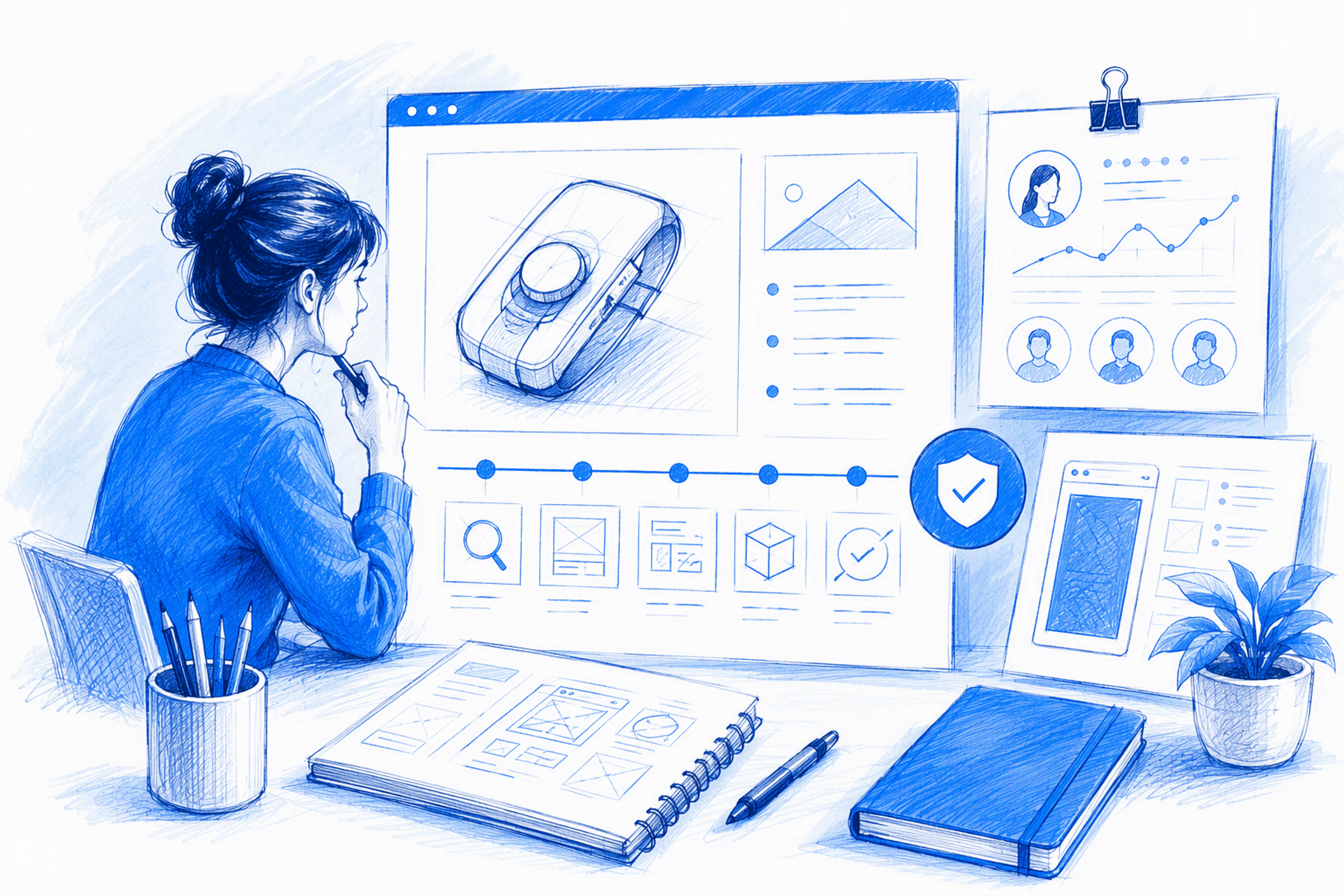
The best product design portfolios make context, ownership, key decisions, execution quality, and credible outcomes easy to scan. They do not document every workshop or wireframe. We recommend treating each case study as an edited trail of evidence—not a gallery of polished screens or a generic UX process template.
Table of Contents
- TL;DR
- Table of Contents
- What convincing product design portfolios prove
- How hiring managers scan a case study
- Open with project context, ownership, and real constraints
- Turn UX process into a concise decision story
- Show UI craft and frontend awareness as product evidence
- Prove impact when perfect metrics are unavailable
- Choose the right format: portfolio website or PDF
- Use this evidence checklist before publishing
- FAQ
- Build a portfolio around evidence
What convincing product design portfolios prove
Many product design portfolios look polished. Far fewer explain what the designer changed, why the decision made sense, and whether that judgment could transfer to another product.
We look for five signals:
- Context: What product, audience, and problem shaped the work?
- Ownership: What did the designer personally lead or deliver?
- Reasoning: Which evidence and trade-offs informed the direction?
- Execution quality: How well did the interaction and interface address the problem?
- Credible outcomes: What shipped, changed, or was observed?
Visual craft matters, but an attractive showcase is not automatically a convincing portfolio. Length does not guarantee rigour either. Careful editing can demonstrate product judgment because it shows that the designer knows which information matters. Our hiring-side guide to the best product design portfolios offers a broader comparison framework.
Visual polish attracts attention; evidence sustains it
High-fidelity screens demonstrate taste and create interest. On their own, they cannot establish authorship, explain why one option beat another, or show how the interface responded to technical and commercial constraints.
We recommend introducing mockups after the problem and decisive trade-off are clear. The screen then becomes evidence: the visible result of a reasoned product decision.
Use a flexible evidence sequence
A strong sequence usually covers context, role, constraints, decisions, execution, and outcomes. These are adaptable building blocks, not mandatory chapters.
Copying another designer’s layout or process story often strips away the details that make work believable. Product development is rarely tidy. A case study should preserve that reality while shaping it into a coherent narrative.
How hiring managers scan a case study
An initial review often covers the project title, opening summary, role, key visual, major decisions, and outcome. If those elements remain ambiguous, detailed process documentation is unlikely to rescue the story.
Evaluators may look for different signals:
- Recruiters check role relevance, seniority, and ownership.
- Founders look for commercial judgment and practical execution.
- Design peers inspect reasoning, craft, systems thinking, and trade-offs.
We design case studies for layered reading: a short summary for scanning, descriptive section labels for evaluation, and optional depth for specialists.
Make the essential details visible immediately
The opening should identify the product, audience, problem, personal role, defining constraint, and available outcome signal.
Instead of “I redesigned the blog experience,” try: “I led the information architecture and UI redesign for a B2B platform’s blog, working with content and engineering to improve article discovery within an inherited publishing system.”
That version establishes context and ownership before presenting research artefacts.
Write for multiple evaluators
Give recruiters immediate role clarity. Show founders the connection to customer or business value. Give design peers access to the decisions behind the final interface.
Descriptive headings and captions help. “Reducing competing navigation paths” communicates more than a vague label such as “The journey.”
Open with project context, ownership, and real constraints

Before presenting screens, establish the product, audience, project state, objective, team, timeline, and constraints. This prevents readers from mistaking collaborative output for individual work.
Precise first-person language separates personal contribution from team output. Inherited systems, limited engineering capacity, incomplete research, deadlines, and confidentiality are not weaknesses to hide. They explain why a decision was appropriate rather than theoretically perfect.
Write an unambiguous ownership statement
A useful ownership statement explains what the designer led, supported, collaborated on, and did not own.
Replace “I designed the experience” with named responsibilities: “I led user-flow definition and interface design, contributed to the content structure, partnered with engineering on responsive behaviour, and did not own analytics implementation.”
That specificity makes hireable product designer portfolio examples easier to distinguish from attractive but ambiguous team showcases.
Show how constraints affected the work
Connect each meaningful constraint to the available options and resulting trade-off. If engineering capacity ruled out a new search system, explain how improved taxonomy and navigation provided a proportionate response.
This reveals judgment and shows why the final interface took its particular form.
Turn UX process into a concise decision story
Many UX portfolios become process diaries. We prefer a tighter chain:
- Evidence observed
- Insight identified
- Options considered
- Trade-off made
- UX or UI response
- Outcome evidence
Include research, workshops, and wireframes only when they materially changed the direction. Supporting detail can sit in expandable sections, linked documentation, or a short appendix.
Connect research to a design change
Pair each finding with the behaviour or friction it revealed, then show the resulting content, architecture, interaction, or interface response.
For example, if users struggled to distinguish article categories, the team might simplify the taxonomy, revise labels, and clarify category relationships. The finding now connects directly to a design decision.
Lead with the decisive trade-off
Find the point where user, business, or technical needs competed. Explain the alternatives and why the chosen direction matched the available evidence and constraints.
That decision is usually more persuasive than a chronological account of every activity. It shows how the designer works when no option is perfect.
Cut material that does not support the argument
Remove workshop photographs without an attached decision, generic method explanations, repeated wireframes, unused artefacts, and decorative mockups that show no new evidence.
Keep enough detail to make the reasoning understandable. Editing should remove noise, not turn decisions into unsupported claims.
Show UI craft and frontend awareness as product evidence
Strong portfolios demonstrate typography, hierarchy, spacing, responsive behaviour, accessibility, component logic, interaction details, and system states. More importantly, they explain the product purpose behind those choices.
Frontend understanding can expose edge cases, reduce handoff ambiguity, verify responsive behaviour, and protect interaction quality during implementation. Our approach to UX/UI design connected to frontend reality treats these capabilities as one delivery system.
Annotate what screenshots cannot explain
Static images rarely reveal responsive transformations, component variants, loading states, keyboard behaviour, focus management, or interaction feedback.
Use concise annotations tied to comprehension, task completion, consistency, accessibility, or maintainability. Explain why a detail exists rather than merely describing its appearance.
Present UX, UI, and frontend as one advantage
A coherent story follows one line: UX reasoning defines the interaction, UI craft makes the hierarchy legible, and frontend awareness tests implementation feasibility.
The advantage is not a longer list of tools. It is the ability to carry product intent further into the shipped experience.
Prove impact when perfect metrics are unavailable
Not every project has accessible analytics or a clear conversion result. Other useful evidence can include experiment findings, usability observations, operational improvements, adoption, stakeholder acceptance, shipped scope, and clearly labelled qualitative feedback.
Separate observed outcomes from expected effects. We also recommend distinguishing team-level results from personal contribution.
Never invent precision or claim “improved engagement” without naming the supporting signal. Our guide to product design portfolio trust signals explains how hiring teams can assess evidence without relying on inflated claims.
Write a credible outcome statement without analytics
State what shipped, what changed, who adopted it, and which evidence was available.
For example: “The revised navigation, category structure, and responsive article templates shipped across the blog. The content team adopted the component system. Engagement analytics remained confidential, so this case study reports shipped scope and stakeholder feedback rather than claiming a numerical improvement.”
Clear limitations can increase trust.
Present a blog redesign as an evidence chain
A blog redesign case study should begin with the content or discovery problem, not the finished interface. It can then show how information architecture, content structure, visual hierarchy, and interface treatment addressed that problem.
If verified performance data is unavailable, keep the outcome precise: shipped changes, stakeholder adoption, reduced structural complexity, or documented qualitative observations. Intended impact is not measured impact.
Choose the right format: portfolio website or PDF
Neither format is universally superior. A portfolio website suits discoverability, responsive demonstrations, regular updates, and a connected body of work.
A PDF can support tailored applications, interviews, offline review, confidential sharing, or submission requirements. Both formats should contain the same core evidence while adapting navigation and density to the medium.
What belongs on the portfolio website
Project cards should communicate the problem, role, contribution, and outcome signal—not only an image and project name.
Support the work with a focused About page, clear capabilities, relevant location details, consistent navigation, and an easy contact route. The site should make role fit understandable before every project is opened.
When a portfolio PDF is useful
Tailor project selection and order to the role or review context. A founder may prioritise commercial constraints, while a mature design team may want deeper systems reasoning.
Do not squeeze an entire website into slides. Rewrite the content for linear reading, presentation distance, file size, and the discussion setting.
Use this evidence checklist before publishing
Before publishing, check for:
- A scanable project summary
- Clear product and audience context
- Personal ownership separated from team output
- Constraints connected to decisions
- At least one meaningful trade-off
- UI craft beyond polished hero screens
- Responsive and implementation awareness
- Outcomes labelled by evidence strength
- Clear contact information
Borrow evaluation principles from strong examples, not their aesthetics. Visual sameness rarely makes a portfolio more credible.
Review the work from both sides
As designers, we ask whether a reader can identify the role and strongest decision quickly, whether every artefact supports the argument, and whether outcomes match the available evidence.
Hiring teams can ask whether individual ownership is clear, user and business needs are balanced, visual craft is supported by interaction reasoning, and technical constraints are addressed.
For a practical example, our design portfolio shows how we connect UX thinking, UI craft, and frontend execution. Our broader hiring-side portfolio guide also compares the signals across different portfolios.
FAQ
What should a product design portfolio case study include?
Include the product context, audience, problem, personal role, constraints, pivotal decisions, execution details, and credible outcomes. Every artefact should help explain a decision rather than merely prove that an activity occurred.
How long should a product design case study be?
It should be concise while keeping the reasoning clear. A scanable summary, descriptive sections, and optional supporting depth work better than an exhaustive diary that buries ownership and results.
Do product design portfolios need performance metrics?
No. Verified metrics are useful, but shipped scope, usability observations, stakeholder adoption, component reuse, and labelled qualitative feedback can also provide evidence. Never present an intended effect as measured impact.
Should UX portfolios follow the double-diamond process?
Only when it accurately represents the project. We prefer an honest decision narrative connecting evidence, alternatives, trade-offs, interface responses, and outcomes.
Is a portfolio website better than a PDF?
A website supports discovery, interaction, updates, and multiple projects. A PDF works well as a tailored supplement for applications, interviews, offline reviews, confidential work, or formal submissions.
Build a portfolio around evidence
A convincing portfolio makes product judgment visible without sacrificing craft. If our mix of UX thinking, distinctive UI design, and implementation-aware execution fits what your team needs, explore our product design work and start a conversation.